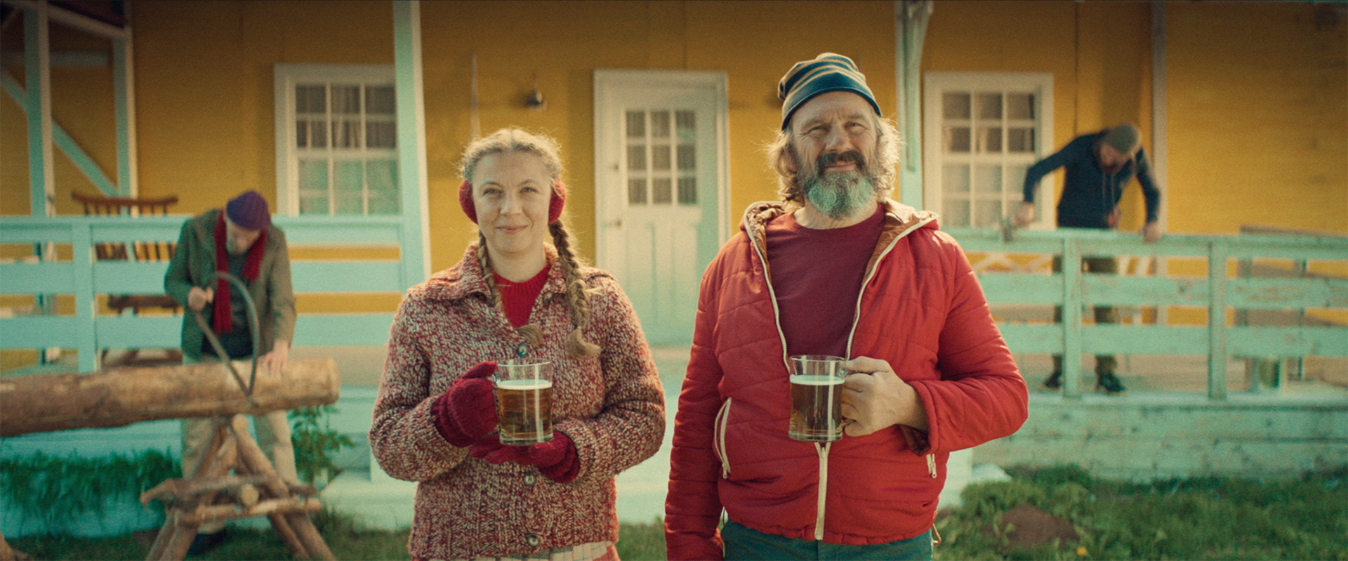
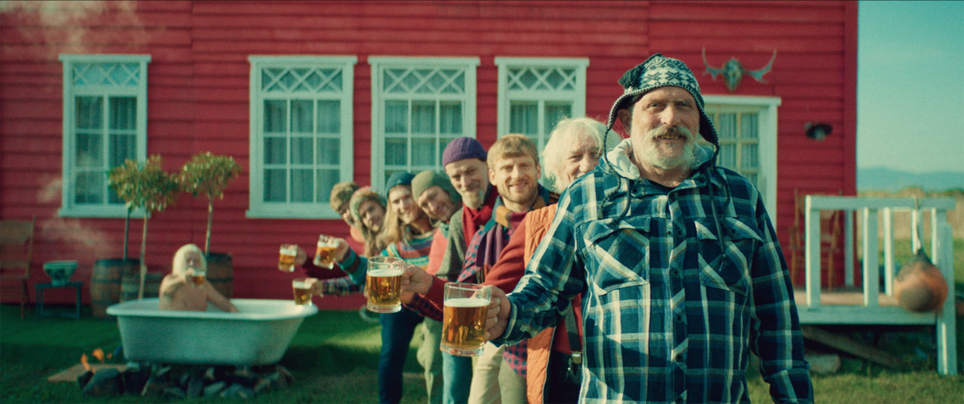
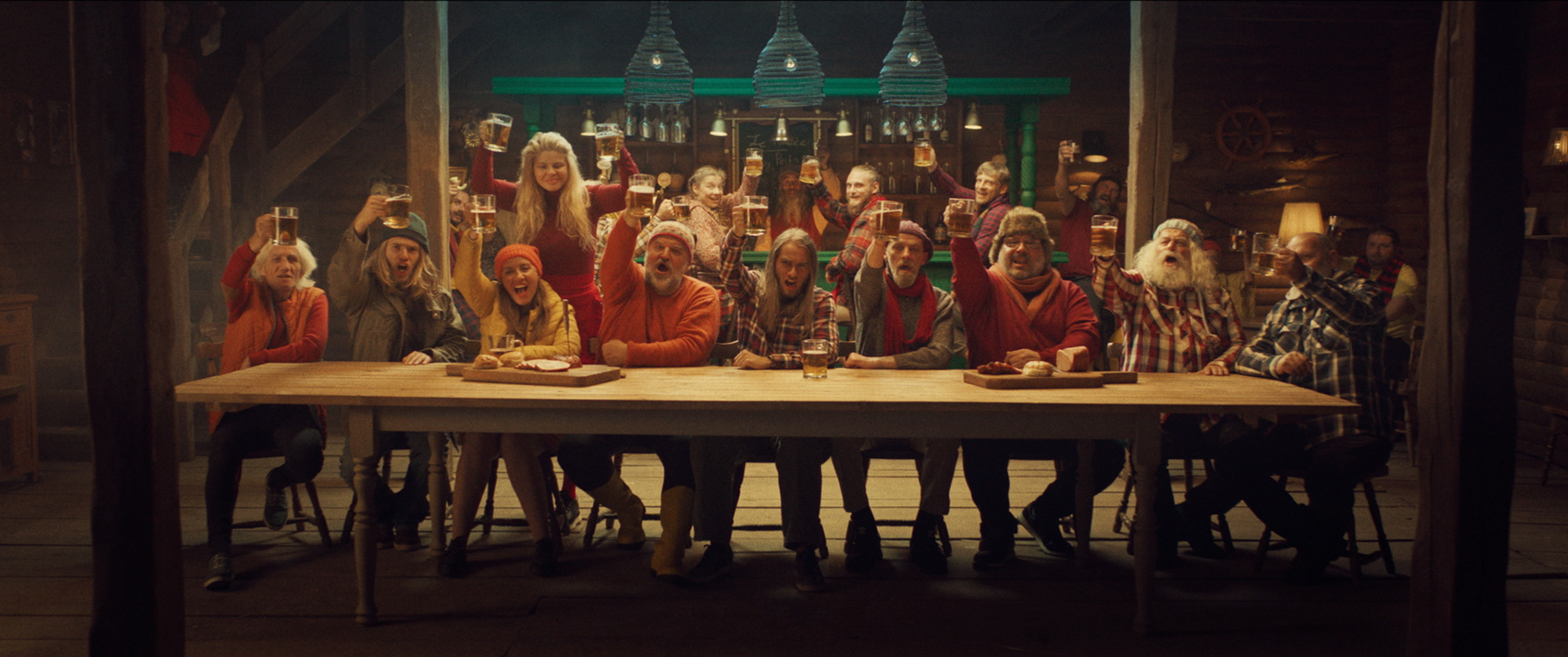
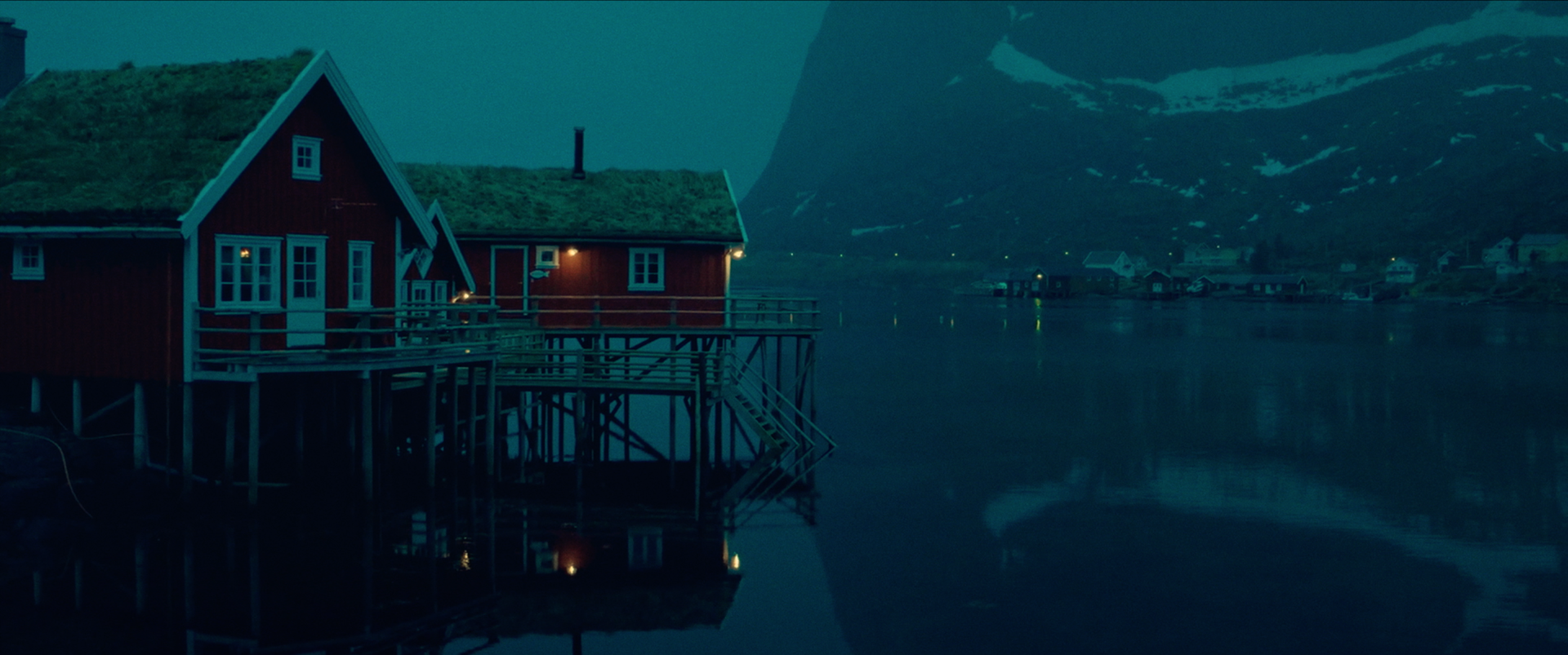
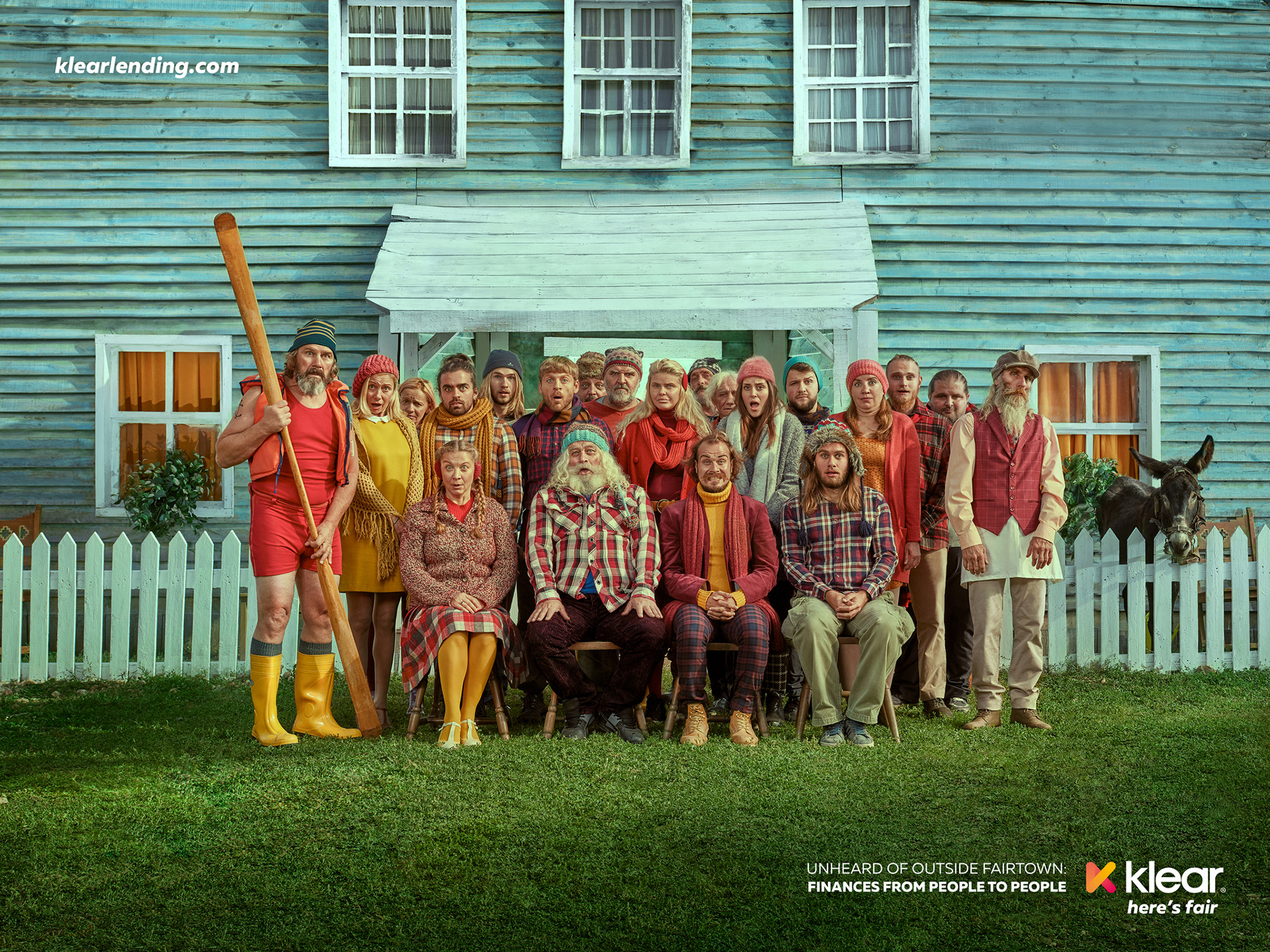
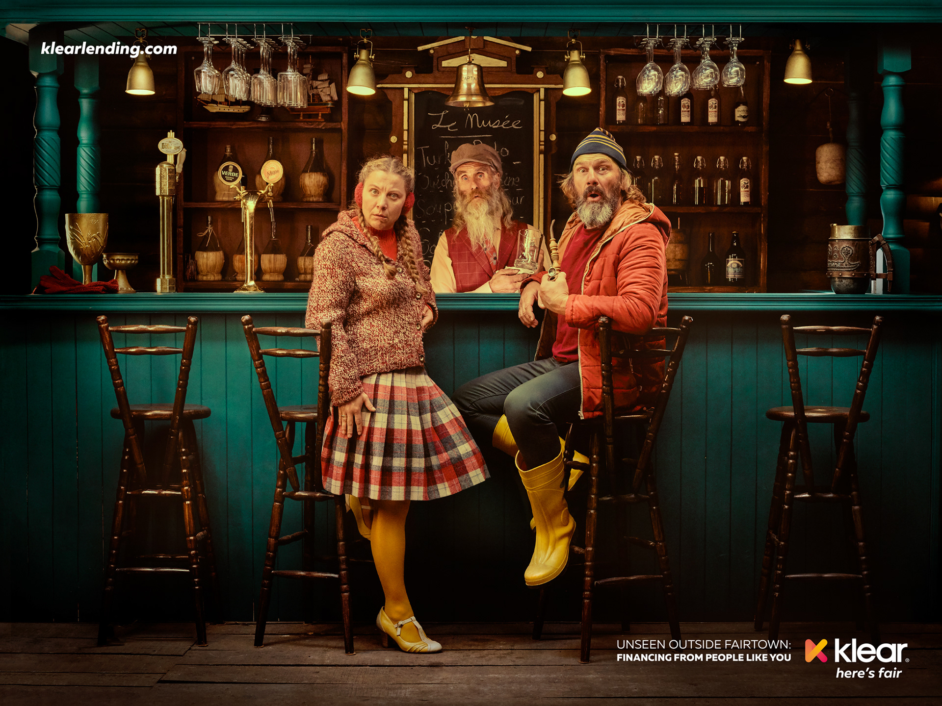
Klear is a peer-to-peer platform positioning itself as the fairplayer in fin-tech services with a complex fairly new financing system for the Balkan market. In order to explain the service in an understandable, human language, we created Fairtown — a utopian village exemplifying the harmonious living of a community that has only ever known a peer to peer financial system. It explained Klear's mechanics through its citizens: Agnes invested in Robin’s canoe, just like you could invest in someone’s education or house on Klear.
The campaign came to life in a series of TVCs, each showing the peer-to-peer system in action, and a series of print visuals featuring the most memorable characters from Fairtown, and their reactions when they learn of the rest of the world’s faulty financial system. It appeared in digital, social media and OOH.
Role: Head of Art, Art direction, Production craft, Photography
Fairtown received a purposefully exaggerated color aesthetic: the warm cross processing and slight oversaturation in combination with dominant reds and yellows add to the notion of camaraderie.
Published in Lürzer's Archive vol. 5+6/2021
Featured in Advertising @ Behance curated gallery
Bronze in Craft: Photography/Print&OOH @ ADC Europe '22
Gold winner in Craft: Art direction @ FARA Ad festival '22
Gold winner in Craft: Photography @ FARA Ad festival '22
Bronze in Craft: Photography/Print&OOH @ ADC Europe '22
Gold winner in Craft: Art direction @ FARA Ad festival '22
Gold winner in Craft: Photography @ FARA Ad festival '22
AGENCY: proof.
CLIENT SIDE: nikolay stoynov
CREATIVE DIRECTOR: angel iskrev
HEAD OF ART: emanuela belovarski
COPYWRITER: boyan zlatarski
GRAPHIC DESIGNERS: bo aleksieva, bozhidar ivanov
ACCT. DIRECTOR: juliana tsvetkova
PRODUCTION: push pull production
DIRECTOR: angel apostolski
DOP: anton ognianov
PROD. DESIGNER: vania ivanova
STYLIST: mina kaye
PHOTOGRAPHY: whaleworx studio /
ivaylo petrov & emanuela belovarski
RETOUCH: emanuela belovarski